Own product · 2026
Omuch
An app that helps creative freelancers take care of the business side of their work with the same attention they give the creative side. I created the brand, defined how the interface should look and refined the experience screen by screen.
- Type
- Own product · web app
- For
- Creative freelancers
- My role
- Brand, interface direction, UX and website
- Status
- Invite-only launch
01 · The idea
Creatives are great at creating. The business side is usually improvised.
Designers, photographers, videomakers and illustrators know how to deliver great work, but the business side usually ends up in scattered spreadsheets and messages. Omuch was born to bring it all into one place. The product details will come with the launch.
02 · My part
From the brand to the last screen.
I created the identity from scratch: logo, color and typography. In the interface, I defined the look and fixed UI and UX issues on every screen. The screens were built with AI under my direction, which let the project move at the pace of a team, with me deciding every detail.
03 · Brand
An orange ring and a name that’s easy to say.
A round, solid symbol opens the word, set in lowercase with soft corners. The brand had to feel friendly and trustworthy at the same time: Mandarin orange brings energy, and the almost-black ink gives the weight of a serious tool.

Outfit
Geometric and friendly. From headlines to dashboard numbers, the same family.
- Mandarin#F26B1D
- Ink#1D1A17
- Sand#FAF6F2
- Night#0E0F1E
04 · Interface
Numbers you actually want to keep an eye on.
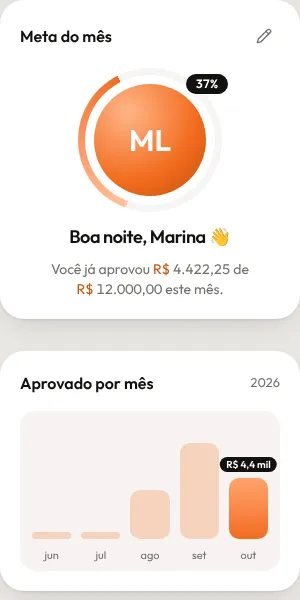
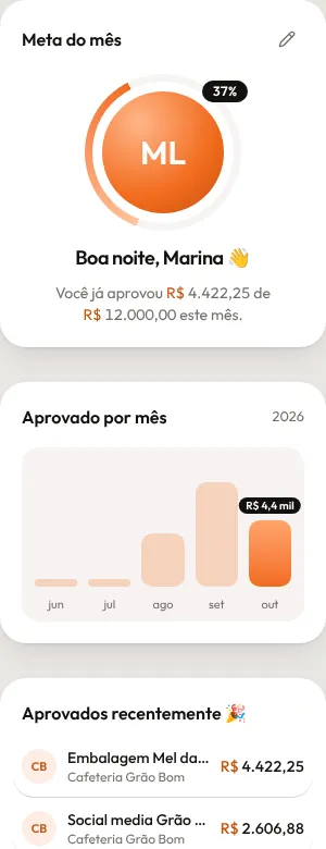
Rounded cards, plenty of breathing room and orange saved for what matters. The dashboard shows the month in a light way, for people who don’t like spreadsheets.
One orange only
The brand color shows up on what asks for action or shows progress. Everything else stays in sand tones, so the numbers can breathe.
Cards instead of tables
Each piece of information lives in a rounded card, with a short title and a highlighted number. You can understand the month at a glance.
Conversational tone
"Good evening, Marina." Short, friendly copy, like a colleague helping organize the month, not a system.
Made for phones too
The cards stack into a single column without losing anything along the way.
05 · What the client gets
With the sender’s brand.
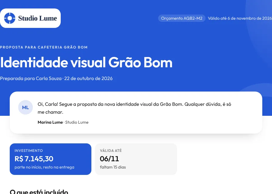
The freelancer sends the client a page with their own brand and colors, not Omuch’s. In the example, a fictional studio in blue. The page was designed mobile-first, since that’s where clients usually open it.

Own project. The brand, the interface direction and the UX decisions are mine; the screens were built with AI from that direction. Names and values on the screens are examples.
See other projects