
Landing page · Online course
Método
Dias Food
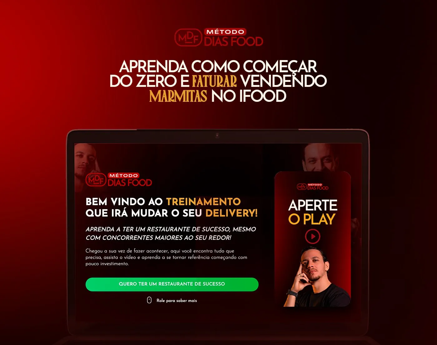
Sales page for Patrik Dias’s course, which teaches how to start from scratch and make money selling meal boxes on iFood. I designed and built the page, from the video at the top to the buy button.
- Client
- Patrik Dias · Método Dias Food
- Project
- Course sales landing page
- My role
- Page design and development
- Year
- 2025
- Made for


01 · The challenge
Selling a course to people who think they don’t have time.
Método Dias Food’s audience is the small delivery business owner who works in the kitchen all day and thinks they need a lot of money to grow. The page had to get this person to press play and make it to the purchase without giving up along the way.
02 · The solution
A long page that answers every question.
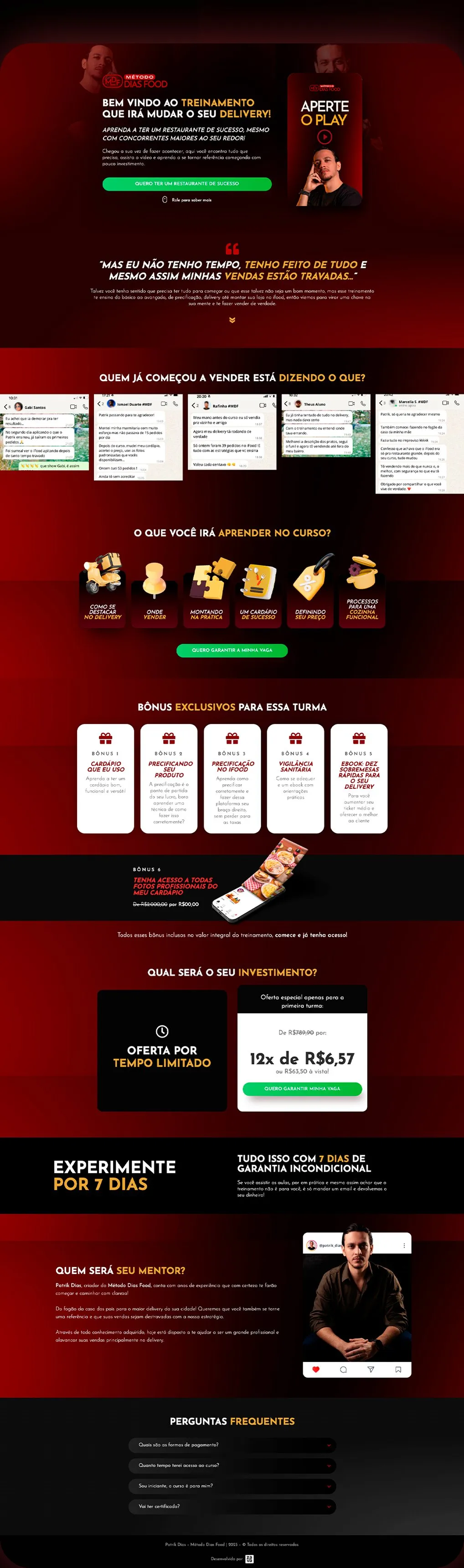
The sales video opens the page, with a "Press play" that leaves no doubt. Then each section knocks down an objection: testimonials, what you’ll learn, bonuses, installment price, guarantee, the mentor and FAQs. The green button appears whenever the decision is close.
03 · The page
From play to the green button.
The whole landing page, top to bottom. Scroll inside the window to see every section.
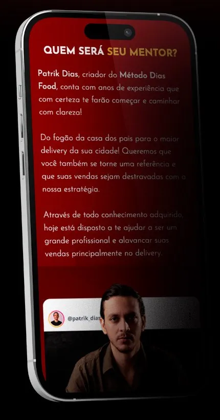
Mobile version
Most of the audience arrives from Instagram, so every section was designed for the phone screen first.
04 · Section by section
Each part has a job.
-
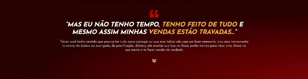
The objection, out loud
Right below the video, the page repeats what the delivery business owner thinks before buying and answers it on the spot.
-
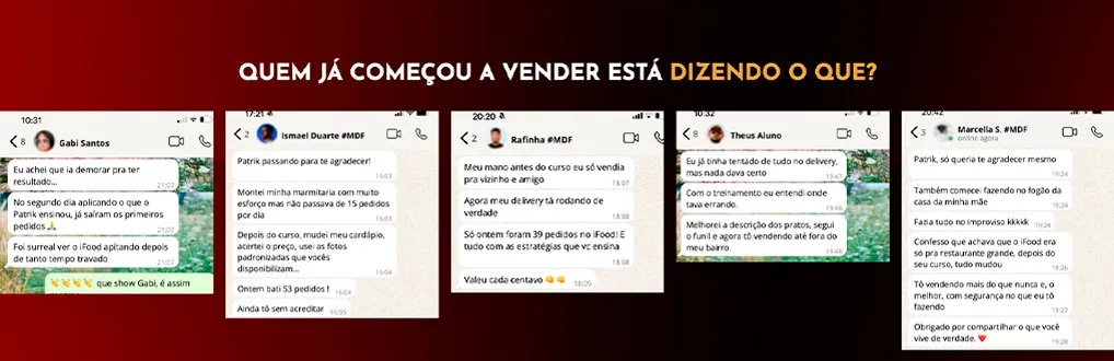
Proof in WhatsApp screenshots
Testimonials show up as real chats with Patrik, which is how this audience is used to seeing results.
-
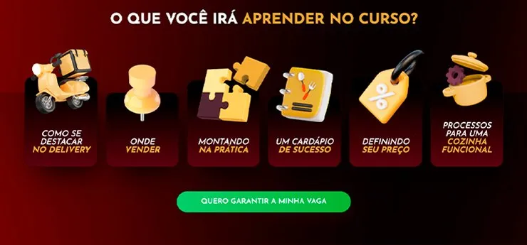
Modules with 3D icons
Six cards with 3D icons make the course content easy to scan on a phone.
-
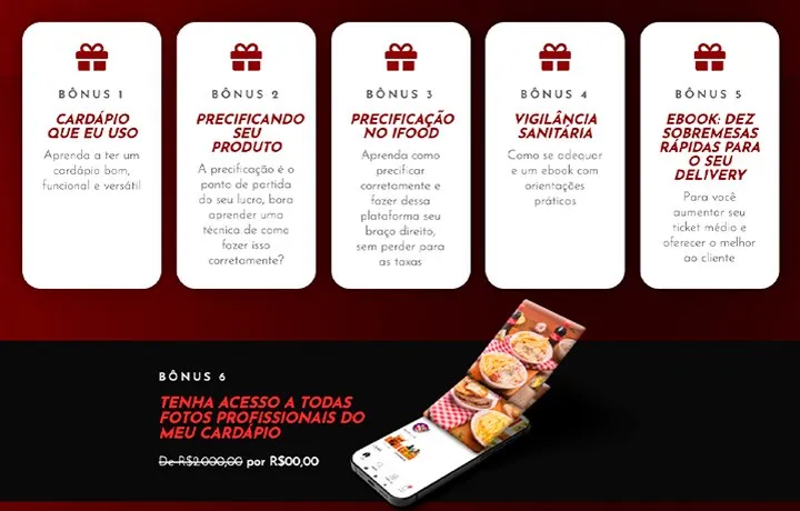
Stacked bonuses
White cards on red for the five bonuses, and a black band for the most valuable one: the menu photos.
-
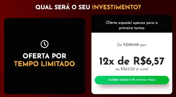
A price that fits the installment
The installment price is highlighted, with the full price crossed out and the green button right below.
-
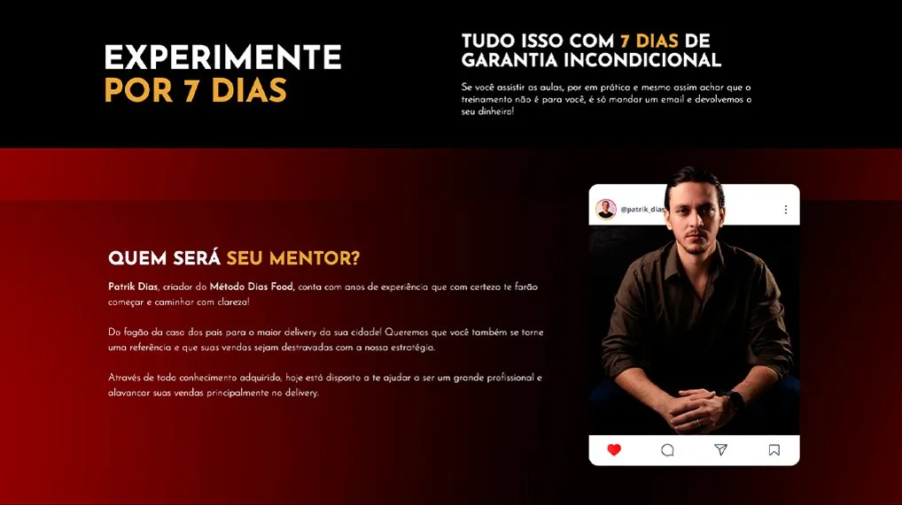
Guarantee and mentor
A 7-day guarantee to remove the risk, and Patrik introduced inside an Instagram post, close to the buyer’s world.
05 · Visual foundation
Kitchen red, highlight gold.
The page follows the red and black of Patrik’s brand. Gold marks the words that sell, like "treinamento" (training), "delivery" and "investimento" (investment), and green is reserved for the buy buttons only.
Brand


Palette
-
Dias Red
#A60000
Backgrounds and gradients
-
Charcoal Black
#0F0000
Page base
-
Gold
#E7A22E
Highlighted words
-
Buy Green
#00CD67
Buy buttons
Typography
Palmore
A tall, narrow serif that looks like an old restaurant sign. It’s the typeface for Patrik’s name and the big headlines.
Faturar vendendo marmitas
Josefin Sans
Geometric, in capitals for section titles, italic for subtitles and light for body text.
Aperte o play
Project developed for Agência Zava. Client: Patrik Dias, Método Dias Food. I designed and built the landing page. The site is no longer live; the images come from the project published on Behance.
See other projects