Visual identity · 2026 refinement
Gois & Silva Advocacia
A law firm founded in 2014 in Limeira, Brazil, by two partners who studied together. The brand was born from the GS monogram inside a circle, in blue and gold. This refinement keeps the idea and adds what was missing for it to work on any piece.
Before and after
The same brand, cleaner.
The concept is the same: the partners’ initials joined inside a circle that recalls a seal. What changed was the finish.
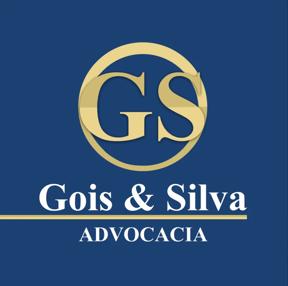
- Flat goldNo gradient or bevel. The color prints the same on paper, screen and embroidery.
- Interlaced G and SThe S crosses over the G with a thin gap, like the partners: two parts of the same firm.
- Double ringOne bold stroke and one thin, like the edge of a seal or a notary stamp.
- Typography with personalityCormorant Garamond for the name and widely spaced Lato for "Advocacia", instead of a generic serif.
Symbol
Building the monogram.
- Optical centerThe two letters share the circle’s vertical axis and are centered in height.
- Interlace gapThe S cuts into the G with a gap of 3.5% of the diameter, which stays visible down to 16 mm.
- Double ringOuter stroke at 2.25% of the diameter and inner at 0.6%, 4% apart.
Versions
A logo for every space.
The vertical version is the main one. The horizontal one goes into narrow spaces, like headers, signs and signatures. The symbol alone goes on profiles, seals and favicons.
Usage
Clear space and minimum size.
Nothing goes into the space around the logo, which equals the height of the "S". Below the minimum size, the interlace disappears; use the symbol alone.
Colors
Blue for trust, gold for achievement.
The blue and the two golds come from the original brand. Ivory and graphite are added for backgrounds and text, without relying on pure white and black.
- Royal Blue#17375FC100 M81 Y31 K6Main color. Background for institutional pieces.
- Gold#C9A95CC21 M23 Y68 K0Symbol, lines and highlights. Never in body text.
- Light gold#E6CF8EC8 M13 Y55 K0Subtitles on blue.
- Ivory#F6F1E7C3 M4 Y9 K0Light background. Replaces pure white.
- Graphite#1F2329C75 M65 Y55 K60Body text on light backgrounds.
Typography
Classic in headlines, clear in text.
Headlines
Aa
Cormorant Garamond · Semibold
Respeito, ética e comprometimento em cada caso.
Text
Aa
Lato · Regular and Bold
Used in body text, contracts, posts and the website. In wide-spaced capitals, it sets "Advocacia" and the labels.
Both are free (Google Fonts), so the firm can use them on any computer with no license cost.
Graphic elements
The ring and the gold line.
Two devices taken from the brand itself: a large piece of the double ring bleeding off the edge, and the dotted line that underlines the name. They work as background and frame without competing with the logo.
Título da peça
Applications
From business cards to Instagram.
Limeira · SP
Atendimento personalizado
Cada caso é uma história. A gente ouve a sua inteira.
Seriedade não precisa ser distância.
Escritório de advocacia
Limeira · SP